GoOut - Dare to go out
OVERVIEW
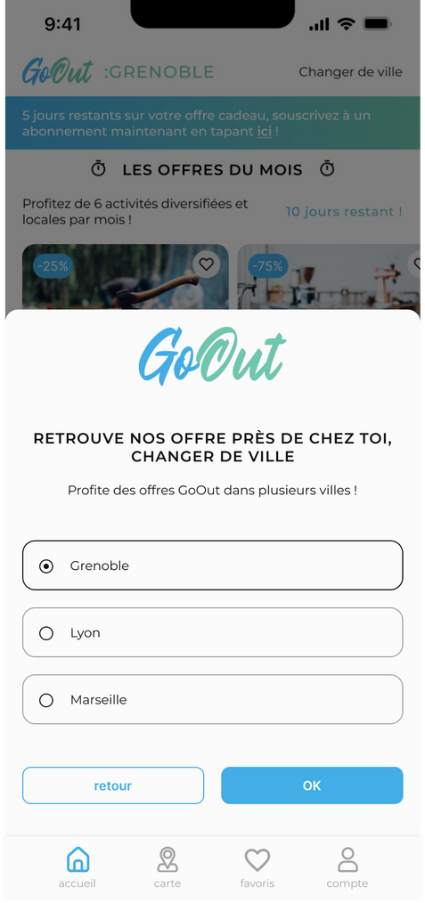
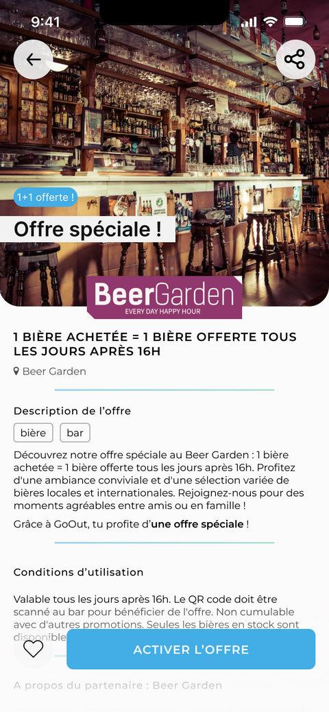
GoOut is the mobile application of a Grenoble-based start-up (France) that aims to share good deals with its users in exchange for a subscription.
The application intends to encourage people to go out and engage in social activities in their city.
MY ROLE
UX/UI Designer
Information Architecture, wireframes, low and high fidelity prototypes
The client's request
The client desired a complete redesign of their existing application.
Project vision and solution
It was agreed with the client that the work would be carried out in three main parts:
-
Information Architecture revision
-
Low-fidelity wireframes and prototype proposal
-
High-fidelity prototype and final design delivery
Audit of the existing live app
To begin, I conducted an audit of the existing application. Although I did not have access to specific quantitative or qualitative user experience data, this audit allowed me to gather observations and analysis on various aspects of the application. These observations were taken into consideration in the redesign process to improve the identified areas that required enhancements.
%20-%20old%20app.png)
Preliminary Research
I initiated a phase of preliminary research aimed at gaining a thorough understanding of the project and the GoOut application. This crucial step helped gather a comprehensive set of relevant information to guide our design approach.
This included a thorough analysis of direct competitors, previously conducted by the client, which provided valuable insights into similar applications in the market in the targeted area. Additionally, I performed an analysis of indirect competitors by studying other applications such as Airbnb, Veepee, and Tripadvisor.
This approach was essential in establishing a strong knowledge foundation, allowing us to better grasp market trends, identify strengths and weaknesses of both direct and indirect competitors, and establish references for our own design process.
DIRECT COMPETITIVE ANALYSIS (conducted by the client)
The client's direct competitor analysis primarily focused on exploring the features offered by other applications in the same industry. This approach allowed us to become aware of the existing offerings in the market and identify the most common or innovative features.


✅ POSITIVES (provided by the client)
Connection and registration with social media, skippable onboarding process, daily offers, ability to change city, access to a map, "Favorites" feature, referral program, geolocation option on the map, 5 tabs in the menu, highlighting certain offers, QR code scanning, easy contact option
❌ NEGATIVES (provided by the client)
Weak welcome offer, poorly displayed descriptions, weak referral program, limited subscription options, too many categories
INDIRECT COMPETITIVE ANALYSIS
This second approach allowed us to broaden our perspective and gain additional insights for our design process. It enabled us to draw lessons from indirect competitors, expanding our understanding of the market and uncovering valuable insights to inform our design decisions.


✅ POSITIVES
User-friendly app, strong brand identity in app, quick access to offers, limited-time offers, detailed information in offer listings
❌ NEGATIVE
Few special offers, limited focus on local content
CONCLUSION OF COMPETITOR ANALYSIS
-
Create a visual identity aligned with the brand
-
Develop a user-friendly platform and provide quick and easy access to information
-
Highlight the concept of local offers
Meet our persona!

NALE
AGE
JOB
INTERESTS
Sarah Martin
30 years old
Marketing managment
Shopping, gastronomy, cultural events
ABOUT HER
Passionate about discoveries, she seeks the best deals and promotions in the city. She enjoys exploring local stores, tasting delicious dishes, and participating in cultural events. Her goal is to save money while enjoying the best offers. However, she sometimes struggles to find relevant offers and access coupons easily.
GOALS
-
Find local offers that highlight local businesses
-
Discover new places and activities around her
-
Stay informed about new local offers
PAIN POINTS
-
Difficulty in finding up-to-date relevant offers
-
Lack of time to manually search for promotions
Information Architecture
Before starting any digital wireframe creation work, it was important to understand the positioning of different sections of the application within the information architecture.
The information architecture diagram below was shared with the client to align on the desired number of screens.
.png)
Low-fidelity prototype
After analyzing the mockups provided by the client and receiving validation on the information architecture, low-fidelity screens were designed.

High-fidelity prototype

Details on the subscription page
The subscription feature on the GoOut application is at the core of its functionality as it represents the point of conversion where users decide to commit financially to access the offers.
The design was carefully crafted to convince users by clearly and attractively communicating the benefits of each subscription plan, highlighting the added value of each plan, and providing enough information to establish trust.
Firstly, it was important to understand the desired functionality of the subscription.
-
Users receive a 15-day free trial subscription upon registration.
-
There are four available plans (solo monthly/yearly and duo monthly/yearly).
-
Users can choose between solo and duo subscriptions, either on a monthly or yearly basis. Of course, the annual subscription is more cost-effective and therefore recommended.
-
Users have the option to gift a subscription to their friends.
-
Users can use referral codes to receive a subscription as a gift.


"Scan" feature
During the development of the high-fidelity screens, it seemed relevant to discuss the inclusion of the scan feature with the client. Although it was not originally mentioned in the requirements, it appeared to be important for ensuring a good user experience.
-
Speed and ease of use: Users do not need to manually search for the offer within the application. Instead, they can directly scan the code provided by the partner, which automatically activates and validates the offer.
-
Reducing friction: The scan button eliminates the additional steps mentioned earlier. The experience becomes smoother and more enjoyable.
-
Enhancing engagement: Providing a convenient and quick solution can encourage users to engage with the application whenever they have the opportunity.

The left version presents the scan feature within the menu, positioned in the center. This layout is commonly found in competitor applications.
The center version takes a different approach by using a floating button. This allows for highlighting a specific functionality. It also reduces clutter in the menu bar and provides a cleaner alternative by avoiding overcrowding in the main menu. Since the use of the scan feature is contextual (limited to certain pages only), this button position is more intuitive and can offer a better user experience.
The right version incorporates all the elements of the second version, but with the aim of emphasizing the feature. I decided to change the colors to make the button more eye-catching for users. This third option was the one we ended up choosing.
Final design
Style sheet


